This month has had some controlled chaos for me. I’ve been kept quite busy with big changes in my day job and technical issues with my laptop, but I’ve made a lot of progress on some important but tedious steps in the layout for Far Lands. But the most important news: on Thursday June 25th and Thursday July 2nd, I will be streaming Far Lands with Open the Gates Gaming on their twitch page.

Open the Gates is a nonprofit organization dedicated to making accessible content and tools for TTRPG players, facilitators, and designers. I was lucky enough to meet them at Pax East this year and they had some amazing input into how I can improve the accessibility of the Far Lands book.
The first session, on the 25th will feature discussion of the game and some of the worldbuilding steps, and the second on the 2nd will feature gameplay. I couldn’t be more excited to share the game with them and with the world!
Accessibility features
It’s thanks to the folks at Open the Gates gaming that I knew what to do once I was done putting all the text of the game onto the book pages. I want everyone who’s interested in bonding with friends on the trail, making discoveries, and witnessing the sublime to play Far Lands, and that includes people who don’t experience the book in the same way I do.
It’s been important to me from the start that the book be both readable front-to-back and usable as a reference manual during games. For a long time I struggled to know how exactly to strike that balance. But it turns out, a lot of the same features that help people with different accessibility needs than myself will also make the book better for everyone.
To aid me in this stage, I’ve been referencing this accessibility checklist by Clayton Notestine of Explorers Design and this one by Luka Brave of Psychound games, each of which also has links to a few other awesome resources.
So what have I actually done this month?
Navigation features
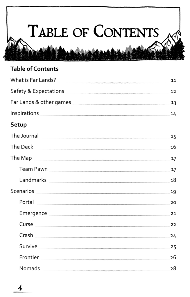
As of this month, I now have a table of contents, and index with clickable links. I have a glossary of terms, and clickable page cross-references. It’s not perfect, but it exists, and that’s all that’s needed for this stage.
I’m currently working on adding a mini-table-of-contents to each section that summarizes and provides links to each of the sub-topics of the chapter. I’ve also added mini versions of some tables when they’re referenced in multiple places in the book, so that you don’t have to flip from one place to another as much.
Readable fonts
I’ve downloaded a few fonts designed for readability: Atkinson Hyperlegible and Lexend are my favorites. These fonts were designed through study and experiments of what makes text more or less readable by a diverse range of individuals. And the result is fonts that honestly also just look good to my eyes. While I’m not using these fonts everywhere in the book, having these available will help me make sure the text is as readable as possible.
Alt Text
For next steps, I will go through and add alt text to all of the art and images in the book. When I spoke with the folks from Open the Gates gaming, I learned that alt text for images can be more than just a literal description of what appears in the image- it should ideally serve the same purpose that the image does for a reader / listener. If the purpose of the image is to convey a feeling, the alt text can be written to accomplish the same!
“Bare Bones” / “Ashcan” edition
Finally, taking a cue from MÖRK BORG, I’ll be releasing a version of the book with a significant amount of graphic elements stripped out. While it’s not as strictly necessary as for MÖRK BORG, a game known for its bombastic and overwhelming visual style, it lets me accomplish a few things at once:
- A minimalistic, high-contrast version of the game for folks with visual impairments or who use screen readers and don’t want to deal with alt text or funky page formatting
- A stripped-down but fully functional version of the game I can use as a freebie for folks who want to try before they buy or can’t afford the full game (and don’t want to take advantage of community copies)
- A quick, lightweight reference document with a smaller file size
This will also be a benefit I can provide to backers of an eventual crowdfunding campaign quickly after funding, as it will be easier to put together than the fully-featured version! It will still feature all the navigation features I described above, but the art and graphic design will be dramatically stripped down.
What’s next?
Over the next month, I plan to continue filling in holes as I find them and polishing up the accessibility of the game. I also have a few variations and minor tweaks to the rules to playtest, so expect some exciting updates as these pieces all come together!